Scrapbook Layout Design: Scrapbook Colour Wheel
When planning your scrapbook layout, choosing your paper, or matching your embellishments COLOUR deserves special consideration during scrapbook layout design.
Considering color scheme and using a scrapbook color wheel can make the difference between a good design and one that truly attracts attention. Fortunately, choosing a colour scheme is not as difficult as it sounds. In fact, the art world has already created a tool to help you do just that:
The Colour Wheel
EK Success Color Selector Wheel - $ 4.98Traditionally colors are represented on a wheel of 12 colors: three primary colors, three secondary colors (created by mixing primary colors), and six tertiary colors (created by mixing the primary and secondary colors). Artists use a traditional color wheel based on the RYB model (red/yellow/blue) with secondary colors of orange, green, and purple.
There are many details that go into the scrapbook color wheel that are not necessary for your scrapbooking. I won't bore you with all the graphic design details, but if you want more information about
 tints and shades,
 primary, secondary, and tertiary colors,
and where neutrals fit in
Check out this Introduction to the Scrapbook Color Wheel
Now to the nuts and bolts of color in your layout...
To use the scrapbook color wheel, you must first pick your base color. The best way to find your base color is to look at the photos you plan to use in your layout. Is there a color that they all have in common? What color can you pull out of your photos that will make a good base color for your page? Picking a color can be as simple or as complicated as you want to make it. You can pick your favorite color out of your photos, or you can consider the feelings different colors evoke . Once you have your base color chosen, a scrapbook color wheel will help you bring your color scheme together very easily.
Colour Harmony
Harmonious colors are colors that work well together and produce a color scheme that looks attractive; the color wheel can be used as a valuable tool for determining harmonious colors.However, the scrapbook color wheel is simply a tool - ultimately it comes down to what you think looks appealing. Color harmony is a natural phenomenon - like the Golden Ratio and Rule of Thirds . Artists for years have looked to nature to find what is naturally appealing and applied it to their art. Now, you can do the same with your scrapbook layout designs.
Choosing a Colour Scheme
Once you have chosen your base color, find it on the scrapbook color wheel. Choosing a color scheme is as simple as finding the complementary, analogous, and triadic colors for that base color. Complementary colors are colors directly across from each other on the wheel.When choosing your color scheme, look at all the different options and cross reference them with your photos. Remember how we said that color harmony is a naturally occurring phenomenon? Well, chances are you will find some complementary, analogous, and/or triadic colors for your base color in your photos.
Hold on! Analo-what? Tria-who? Let's take a moment to define a common vocabulary ...
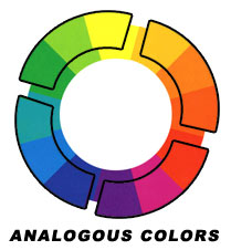
Analogous Colours
Any colors that are next to each other on the color wheel. Typically harmonize well, but may not provide much contrast.
purple and blue
red and purple
yellow and green
red and orange
orange and yellow
Complementary Colours
Colors that are directly opposite one another on the wheel. Typically produce strong contrast.red and green
blue and orange
purple and yellow
Split Complementary Colours
Colours on either side of the complementary colors. Provide contrast, but not as strong as complementary colors.red and blue-green or yellow-green
blue and red-orange or yellow-orange
yellow and red-purple or blue-purple
Triadic Colours
Any 3 colors that create a triangle on the wheel. Provide a balanced color scheme with reasonable contrast.red, yellow and blue
purple, orange and green
No comments:
Post a Comment